Creating and managing a rebrand isn’t an easy process and one simple oversight can turn a simple design into a catastrophe. That’s what almost happened with me. But let’s go back to the beginning to figure out how we got here in the first place.
When I fist began freelancing, I’d been made redundant and needed to get a business website up and a brand together as quickly as possible, so whilst I was generally happy with my branding, I hadn’t poured the same time and energy into it that I would with a client.
I’d built the branding around the idea of paint strokes, hand drawn brush-lines and bold colours to show the human, creative approach to my work. I wanted it to be approachable to encourage clients of all budgets to be enticed to work with me. And for a while, it worked.
But over time, it was having the opposite effect. Generative AI decided to create posters for people with the exact same principles. Paintbrush strokes everywhere, harsh colour contrasts and even the font I used for my logo was annoyingly similar to the “ChatGPT special”. My branding suddenly stopped looking approachable – it looked cheap and lazy.
So, as a period of downtime hit, I decided to redesign my logo and rebrand everything I wanted to be from a professional standpoint. I still wanted to keep my initials as the logo, still wanted to show the creativity through the branding, but in a more sleek, clean-yet-stylised way.
How it started…
The original logo was this very simply combination of my initials in the two contrasting brand colours. Using “Good Brush” as the logo font set the tone for a lot of the sketch- and illustration-based imagery.
The two colours allowed it to be clearly separate and clear at almost any size and served its purpose well.
Now, of course, I wanted to step away from the Good Brush logo and create something cleaner, more stylised and neater, but still following the same theme. So instead of brush strokes, I’ve pivoted to marker strokes in the new design, and rather than simply using one of the many marker-style fonts out there, I decided to go more graphical with it.
The First Draft, and the PROBLEM
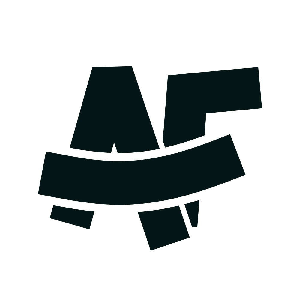
The first draft of this logo design was a solid enough representation of the concept.
The AF motif drawn in one marker colour, with the shared horizontal stroke on top in the contrast colour.
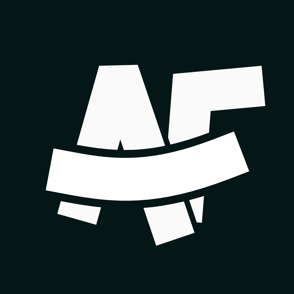
However, something more sinister began to form in the shape that only became apparent when I created the white-only [FORESHADOWING] version of the logo.
Oh no… surely not…
When those strokes are all the same colour, it highlights that when A & F are combined, they look similar to an N & F combined.
Not exactly the combination of letters that I want to be associated with.
For the (fortunately) uninitiated, NF stands for National Front, a group of individuals who would definitely not be particularly fond of me, primarily due to the colour of my skin.
As soon as I’d rendered the all-white version of the logo, I realised that it looked very similar to the National Front logo, which I won’t display here but it’s a very quick google image search.
Initially, I wasn’t sure if it was just me, so I sent it to a few different friends and they all noticed it pretty quickly too, and I’d already made up my mind to tweak it anyway.
How it looks now…
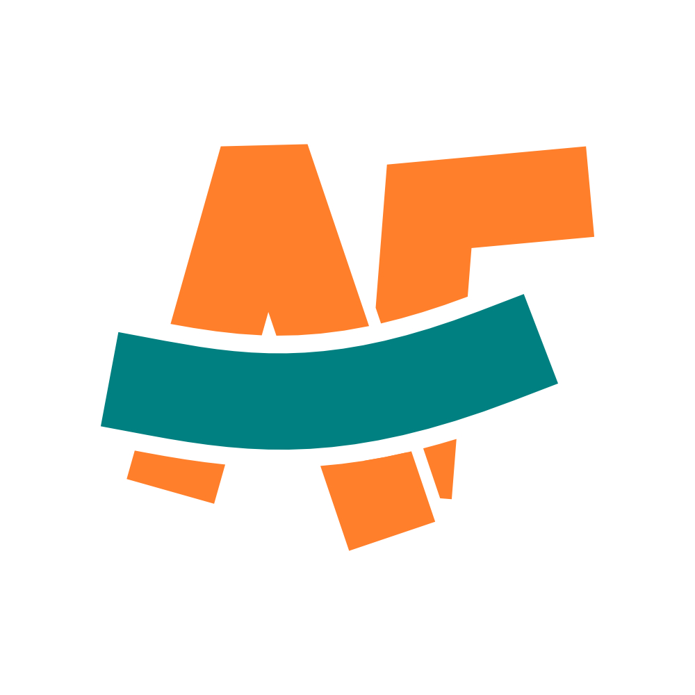
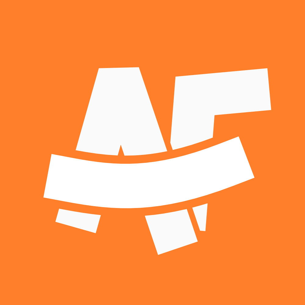
I didn’t want to abandon the idea, and I certainly can’t or won’t abandon my name. So it required some small, but smart design tweaks to get to what we see today.
Separation was a key step in this. Separating the A and F strokes allowed them to become their own letters rather than one continuous stroke, which wasn’t my initial vision for the logo, but still worked really well.
Secondly, a thicker negative stroke on the horizontal “smile” device makes it stand out more across versions and also clarifies the nature of the logo a little more.
A small part of me will never be able to “unsee it”, but it’s clear and different enough for me to be happy carrying this forward as the centrepiece of my brand.
How about you?
Do you need a rebrand and want to make sure it’s done by someone with a paranoid obsession with not making far-right symbolism?
I’m your guy! Fill in the form and I’ll get back to you to get the ball rolling!CTA Form
Why I Stopped Offering Entry-Level Websites
This week I took the step of removing all entry-level pricing from my website and marketing materials, and honestly, it wasn’t a difficult decision. It means that I don’t have to engage certain conversations anymore and it frees me up to do the level of work that I want without setting myself up to compete in a space I don’t desire to be in.
As a freelancer, it’s very rare that you turn down work when the bills need paying. And an easy way to make sure that money doesn’t come in is to price people out of your service. And yet, that’s exactly what I’ve done and it’s the smartest decision I’ve made this year.
I used to offer cheap-as-dirt landing page design and what I called “Basic” sites for a few hundred of the Queen’s finest pounds (I still can’t get comfortable with Charles on the money), but I made the conscious decision not to do that anymore for two simple reasons.
Quality
Deliberately offering a watered-down version of my core product isn’t the way I want to operate. Initially it was to enable me to provide a service for people with a lower budget, but the trade-off of giving out what I would consider a sub-par product wasn’t sitting right with me.
Either I take the hit on being able to deliver something good, or the client gets a poor, rushed website that I can’t take pride in.
For me, that’s unacceptable.
A.I.
AI is drastically lowering the floor for what entry level design looks like (both price-wise and quality-wise) and competing with that is a race to the bottom. A client with a smaller budget is always going to be stuck between paying a professional or getting something passable for close-to-free by writing a few prompts.
Trying to undercut A.I. is a pointless game and whilst I’d love to help smaller clients out more often, trying to provide value whilst competing in the price range of ChatGPT just isn’t going to happen.
Now, will ChatGPT actually provide them with a usable website? That’s a different story.
Spoiler: The answer is no, because once it spits the files out, you’re on your own.
So what now?
I still offer bespoke and eCommerce sites at a price that allows me to deliver a quality end product without compromising my standards. Your website is far too important to settle for “passable”. Take a look at my Web Design Services to see the starting prices or take a look at the Portfolio to see what work I’ve done before.
Need a bespoke website?
Let’s get started on your brand new bespoke website today. Custom functionality and no compromise on quality. Fill the form in and let’s get started today!